Mental Models
18 September 2016
Imagine how you’d feel if you woke up one morning and the operation of all the light switches in your home was reversed. Suddenly everything you thought you knew about how to use your own light switches is wrong. You’d feel pretty bewildered, right? Probably angry too. Maybe in time you could get used to the new world order of light switch operation, but maybe you’d never get used to it. Your mental model of how light switches work based on years of experience would be completely broken. OK, it’s a silly hypothetical example, but those emotions are an accurate description of how I felt recently upon installing iOS 10 on my iPhone.
iOS 10 brings some great new features and advancements, but upon first running it my initial impression was one of total confusion because I could no longer work out how to unlock my phone! It turns out I’d taken the successful accomplishment of this operation for granted during the previous seven years of iPhone ownership. My mental model of how to unlock an iOS device had been broken by the changes Apple introduced to the way the iOS lock screen works. Judging by the comments I’ve seen since iOS 10’s introduction, I’m certainly not alone.
In all versions of iOS prior to iOS 10, unlocking the device took you to the familiar home screen of app icons, or SpringBoard to give it its technical name. With iOS 10, Apple introduced a new conceptual layer in-between SpringBoard and the lock screen where widgets and notifications are shown. In spite of having read about iOS 10’s features before its release, I hadn’t appreciated that this was the case and therefore hadn’t updated my mental model accordingly. When I pressed my thumb against the Home button I expected Touch ID to unlock my phone and take me to the home screen as usual. Instead what happened was I got a confusing and seemingly random prompt about pressing Home to open.
After much head-scratching and some experimentation, I worked out what the new model is. Unlocking the phone actually just unlocks the widget/notifications layer and from there you can press the Home button to go to the home screen. I generally don’t like to veer too far from what Apple considers the best defaults and tried to get used to the new behaviour, but unfortunately after seven years I couldn’t reprogram my mental model. Fortunately I was able to revert the lock screen to iOS 9 levels of sanity by going into Settings -> General -> Accessibility -> Home Button and enabling the Rest Finger to Open option.
The lock screen isn’t the only area where iOS 10 broke my long-established mental model. The Mail app displays a list of your emails from most recent at the top to older ones at the bottom:
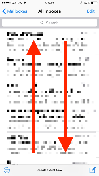
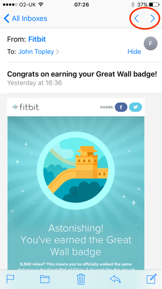
Prior to iOS 10, when opening a single email to view it, a couple of handy buttons in the top-right hand of the toolbar would let you quickly open the previous or next email in your inbox. The buttons displayed arrows that matched the chronological orientation of the inbox on screen. Pressing the up arrow opened the next newer email if there was one and pressing the down arrow opened the next older one.
In iOS 10 these arrows have been tweaked so they match the back and forward controls in a web browser. Which seems like it might be a good idea in terms of consistency, only it’s broken my model model and means I now have to think briefly about which button is the correct one to press for what I want to achieve instead of it being able to do it automatically.
Starting with pioneering the commercial use of the graphical user interface in the 1980s, Apple forged a well-deserved reputation for industry-leading computer usability. I’m not someone who doesn’t like progress, but sadly I think this reputation has been eroded in recent years. I can understand the reasoning behind the iOS 10 lock screen changes, which are as a result of being able to do much more via widgets without having to fully unlock your phone. However, there’s the very real downside of confusion and frustration for the millions of iPhone users who haven’t read anything about iOS 10 other than its public availability and who suddenly find their familiar and comfortable mental models of how the thing works completely shattered.
The Mail app change is worse in terms of justification; it feels like a gratuitous change for change’s sake. I like to imagine that Apple still has a usability lab and does actual usability testing with real users, but in truth it’s hard to know nowadays. I can’t help feeling that if they did they’d have a better understanding of the consequences of breaking long-standing mental models.