Inverting Buttons
16 August 2014
Arguably the most controversial user interface change Apple introduced in iOS 7 was borderless buttons. Personally, whilst a fan in general of the cleaner iOS 7 look, I like buttons to look like buttons by at least having a border to give some indication they can be tapped. Apple recognised there was an affordance issue by adding a Button Shapes accessibility option to iOS 7.1.
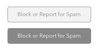
For Daily Offers I wanted to copy the simple bordered buttons that invert when tapped, as used in the Tweetbot Twitter app:
I decided to make my buttons using a couple of images: one for the normal button state and another for the highlighted state. It would also be possible to achieve the desired effect purely in code; I’m sure PaintCode would make this trivial. This is what the button images look like (presented on a white background):
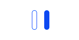
—They don’t look much like the Tweetbot buttons do they? The corners have a larger radius than the Tweetbot buttons because these are 2x Retina display images, so are actually 80 pixels tall for use with 40 pixel tall buttons. Each button is only 21 pixels wide, which seems like a strange number.
The key to this width is that the left button border is 10 pixels wide, so 5 pixels on the actual button. The middle of the button is only 1 pixel wide and finally the right border is also 10 pixels wide. 10px + 1px + 10px = 21px. As you might have guessed by now, iOS supports stretchable images, whereby the ends of the image (called the “caps”) don’t stretch, but the middle does.
The UIImage convenience constructor resizableImageWithCapInsets: is used to create a new UIImage instance that will automatically stretch itself to the required size. I encapsulated this code into a UIImage category. Here’s the header for UIImage+DailyOffersAdditions:
//
//  UIImage+DailyOffersAdditions.h
//  Daily Offers
//
//  Created by John Topley on 23/11/2013.
//  Copyright (c) 2013 John Topley. All rights reserved.
//

@interface UIImage (DailyOffersAdditions)

+ (UIImage *)dailyOffersNormalButton;
+ (UIImage *)dailyOffersHighlightedButton;

@end
Hopefully the purpose of two methods is self-explanatory. Here’s the implementation code for the category:
//
//  UIImage+DailyOffersAdditions.m
//  Daily Offers
//
//  Created by John Topley on 23/11/2013.
//  Copyright (c) 2013 John Topley. All rights reserved.
//

#import "UIImage+DailyOffersAdditions.h"

static NSString *const kNormalButton = @"Button";
static NSString *const kHighlightedButton = @"ButtonHighlighted";

@implementation UIImage (DailyOffersAdditions)

+ (UIImage *)dailyOffersNormalButton
{
    return [[UIImage imageNamed:kNormalButton] resizableImageWithCapInsets:UIEdgeInsetsMake(0.0f, 5.0f, 0.0f, 5.0f)];
}

+ (UIImage *)dailyOffersHighlightedButton
{
    return [[UIImage imageNamed:kHighlightedButton] resizableImageWithCapInsets:UIEdgeInsetsMake(0.0f, 5.0f, 0.0f, 5.0f)];
}

@end
The constants reference a couple of image sets within the app’s asset catalogue named Button and ButtonHighlighted. Each image set simply contains a single 2x image for that button state. The calls to the UIEdgeInsetsMake macro specify that the middle of the button starts 5 pixels inset from the left edge of the image and ends 5 pixels inset from the right edge. The top and bottom insets are both zero.
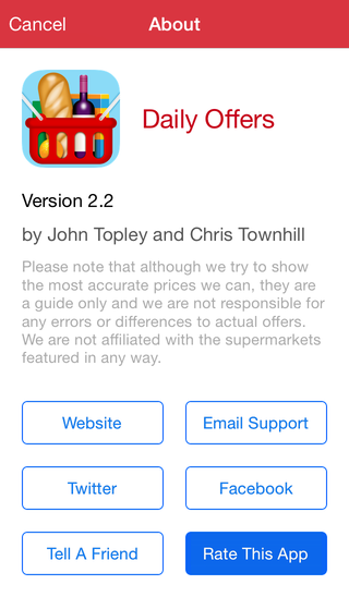
The Daily Offers About screen features six buttons and so is a good study of the category above in use. On this screen I took advantage of the Tag property that Interface Builder provides for any purpose you can think of. I assigned the buttons unique tag values that are sequential, starting at 1000 for the Website button in the top-left position and finishing at 1005 for the Rate This App button in the bottom-right place. An abridged version of the implementation class for SPSAboutViewController is shown below:
//
//  SPSAboutViewController.m
//  Daily Offers
//
//  Created by John Topley on 05/04/2012.
//  Copyright (c) 2012 John Topley. All rights reserved.
//

#import "SPSAboutViewController.h"
#import "UIImage+DailyOffersAdditions.h"

// Button tags.
static NSUInteger const kWebsiteButton = 1000;
static NSUInteger const kRateThisAppButton = 1005;

@interface SPSAboutViewController ()

- (IBAction)cancel;
- (IBAction)emailFriend;
- (IBAction)emailSupport;
- (IBAction)openFacebook;
- (IBAction)openTwitter;
- (IBAction)openWebsite;
- (IBAction)rateApp;

@end

@implementation SPSAboutViewController {}

#pragma mark - User Interface

- (void)customizeButtonWithTag:(NSInteger)tag
{
    UIButton *button = (UIButton *)[self.view viewWithTag:tag];
    [button setBackgroundImage:[UIImage dailyOffersNormalButton] forState:UIControlStateNormal];
    [button setBackgroundImage:[UIImage dailyOffersHighlightedButton] forState:UIControlStateHighlighted];
}

#pragma mark - View Lifecycle

- (void)viewDidLoad
{
    [super viewDidLoad];

    for (NSInteger tag = kWebsiteButton; tag <= kRateThisAppButton; tag++) {
        [self customizeButtonWithTag:tag];
    }
}
A loop within the viewDidLoad method iterates through the tag values and calls the customizeButtonWithTag: method, passing it the tag’s value. The customizeButtonWithTag: method gets a reference to the UIButton control identified by the passed tag and uses the category we saw earlier to set the appropriate normal and highlighted button state background UIImage. And with that, we’re off to the races! Here’s what the final result looks like in Daily Offers, with the Rate This App button highlighted:
Finally, for your convenience here’s a download of the button images that also contains the source Acorn images I used to make them.